Decoding Candlesticks: How to Track Price, Momentum, and Sentiment
Updated October 24, 2025
To the untrained eye, a candlestick chart is just a grid of colors. To a seasoned trader, it’s a living diary of price, emotion, and momentum. Each candle registers the outcome of the battle between buyers and sellers, and what they might do next.
Candlestick charts are the universal language of markets. Stocks, crypto, forex, etc. They speak in patterns, and once you understand their rhythm, you stop guessing and start seeing.
Key takeaways
- Candlestick charts, the universal language of markets, including stocks, crypto, and forex, are not just patterns. They are recurring shapes that reveal shifts in market psychology, providing valuable insights into potential market movements. Each candlestick shows four key prices: Open, High, Low, and Close.
- Each candlestick shows four key prices: Open, High, Low, and Close.
- Context is king: a single candle is just data. However, a candle pattern at a crucial price level, confirmed by high volume, becomes a high-probability trade signal useful to traders at all levels.
What are Candlestick Charts?
A candlestick chart is a method of visually representing price dynamics in financial assets over time. Candlestick charts are composed of multiple data structures called candlesticks that indicate the opening, closing, high and low price of an asset over set timeframes (eg. hour, day) within the analyzed period.
One of the most common tools in technical analysis, candlestick charts can be used to determine the future price movement of an asset based on historical data.

Candlesticks derive their name from their visual resemblance to wax candles as each candlestick bar is composed of a wide ‘body’ and two thinner ‘wicks’.
Candlestick charts are thought to have been invented in Japan in the 18th century by a rice trader, Munehisa Honma. Steve Nison, a renowned author and speaker, is widely credited with introducing candlestick charts to the Western world in his book “Japanese Candlestick Charting Techniques” published in 1991.
How to Read Candlestick Charts
The wide portion of the candlestick referred to as the “real body” represents the range between the opening and closing prices of the asset within the specified timeframe. The thin lines above and below the candle body called wicks or shadows serve to illustrate the highest and lowest traded prices within the specified timeframe.
The four key price points (OHLC)
Here’s what each one means:
- Open: The price at the beginning of the period.
- Close: Where it ended when that period wrapped up.
- High: The highest point price reached.
- Low: The lowest point it dropped to.
Simple enough, but when you see how they all fit together visually, that’s when things click.

The color of the body corresponds to the direction of the asset’s price movement. The green or white (unfilled) candlestick’s body indicates that the price of the last trade was higher than the price of the first one. The red or black (filled) body points to the opposite scenario.
For a green (unfilled) candle the value at the bottom of the body is the price of the first trade of the period, while the value at the top is the price of the last one. For a red (filled) candle the close is positioned lower than the open. A green candle is also often referred to as a bullish candle, the red one is often called bearish.
A short upper wick on a green candle signifies that the close was near to the high in the designated time period. A short upper wick on a red candle indicates the proximity of the opening trade to the highest value of the session.
Candlestick Charts Explained
Candlestick charts allow investors to track and predict trading prices on financial markets. An understanding of candlestick chart patterns can potentially provide the basis for profitable trading decisions with accurate entry and exit points.
Candlestick charts show the direction of price movement over time and enable traders to assess market sentiment. In candlestick charts each bar captures the four most important data points for a given period: open, high, low and close.
Candlestick vs. Bar Charts
As with candlestick charts, bar charts offer information on opening, high, low and closing prices for a specified session. Via a different visual representation a bar chart communicates the same breadth of data as a candlestick chart.
In bar charts the vertical line in an individual price bar represents the price range between the highest and lowest traded values. The left and right horizontal lines show the opening and closing prices, respectively.

In candlestick charts emphasis is placed on ease of visual perception of the direction of asset price movement due to color coding of the thicker real bodies, while bar charts excel at highlighting the difference between opening and closing prices.
Basic Candlestick Patterns
In technical analysis candlestick patterns are employed to forecast a particular market movement.

Based on the number of candlesticks involved, patterns can be categorized into simple (single) candlestick patterns and complex (multiple) candlestick patterns. Bearish patterns anticipate a future fall in the market, while bullish ones serve to predict imminent price growth. Both bullish and bearish patterns can be either simple or complex.
Bearish Candlestick Pattern
Bearish candlestick patterns represent weakness in the market. They are likely to occur when an uptrend is ready to reverse or a downtrend is expected to continue. In complex candlestick patterns bearish trends are in most cases identified by red candles following the green ones. In simple patterns a single red candle with varying body and wick lengths can denote a bearish trend.
Some of the most popular bearish single patterns include “hanging man”, “shooting star” and “gravestone doji” with well-known complex bearish patterns featuring “bearish engulfing”, “three black crows” and “evening star” structures.
Bullish Candlestick Pattern
Bullish candlestick patterns embody the possible imminent reversal of a bearish trend or continuation of an uptrend.
The most recognizable one-candle bullish signals are “hammer” and “doji”. Some common complex bullish patterns include the “morning star”, “three white soldiers” and “bullish engulfing” structures.
Candlestick Technical Analysis
Candlestick charts can display the impact of investor sentiment on asset prices on the market. They are used in technical analysis to determine the best entry or exit points for trades.
Candlestick Technical Analysis Example
The daily candlestick chart for the Ether/Bitcoin (ETH/BTC) trading pair shows three bullish candles with successively higher closing prices towards the end of March 2022. A candle formed on March 28, 2022 had an open at 0.070377, high at 0.071401, low at 0.069738 and close at 0.070731. The next candle had an open at 0.070730, high at 0.072545, low at 0.070692 and close at 0.071693. The candle from March 30, 2022 opened at 0.071693, had a high at 0.072280, low at 0.071197 and closed at 0.071934.
This candlestick pattern indicates the beginning of a bullish trend and serves as a signal for investors to enter a long position.
Candlestick Chart Patterns in Trading
Single patterns:
Single candlestick patterns are formed by just one candle.
Hanging man

The “hanging man” pattern appears at the top of an uptrend. With a small body, an almost nonexistent upper wick and a long lower wick it serves to signal the reversal of a bullish trend and represents a selling opportunity.
Hammer

“Hammer” is a bullish candlestick pattern. It indicates that a downtrend may have reached its bottom and that prices are about to reverse upwards. “Hammer” signals a buying opportunity.
Shooting star

“Shooting star” is a bearish pattern that occurs at the top of an uptrend. It has a long upper shadow, little or no lower shadow and a small real body near the lowest value. This type of candlestick appears when during the designated time period an asset advances significantly but still closes near the starting price. “Shooting star” serves to indicate that an uptrend is about to conclude.
Inverted hammer

“Inverted hammer” appears mainly at the end of a downtrend and signals its possible future reversal. The candlestick usually has a small body at the bottom, an almost non-existent lower wick and a long upper shadow. The long upper wick indicates that buyers drove prices up at some point during the specified period but were faced with selling pressure which moved prices back down.
“Doji”

A doji candlestick forms when an asset's opening and closing prices are effectively the same for a given time period. When looked at separately it generally signals that neither buyers nor sellers are gaining. A “doji” is a sign of indecision and is most effective when analyzed as part of a complex pattern.
Complex patterns:
Complex candlestick patterns are formed by multiple candles.
Bearish Engulfing Pattern

The “bearish engulfing” pattern emerges in an uptrend when sellers outnumber buyers. It predicts a possible incoming decline in an asset’s price. The pattern includes a long red candle body engulfing a small green candle body.
Bullish Engulfing Pattern

The “bullish engulfing” pattern appears at the bottom of a downtrend and indicates a surge in buying pressure. It often serves as a signal of inbound trend reversal as more buyers come into the market to drive prices up. The pattern consists of a large-body green candle engulfing a small-body red candle.
Bearish Harami

A “Bearish harami” pattern suggests that prices may soon reverse to the downside. It is constructed of a bullish candle with a large body followed by a small bearish candle. The opening and closing prices of the second candle are generally contained within the body of the first candle. “Bearish Harami” is largely used as a warning sign rather than a call to action.
Bullish Harami

“Bullish Harami” forms in a bear trend and predicts an imminent market rise. It generally describes a small growth in price, which could be continued in future. “Bullish Harami” may represent a sign for investors to enter a long position. Bullish Harami includes a large-body bearish candle next to a smaller bullish candle.
Three Black Crows

“Three black crows” consists of three long black candlesticks with successively lower closing prices. In “three black crows” the closes are near to or at the lows. It is considered an uptrend reversal or a downtrend continuation signal.
Three White Soldiers
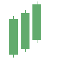
“Three white soldiers” is constructed out of three large white candles with small wicks and consistently higher closes. When the pattern appears amid a bearish trend it is interpreted as a bottom reversal sign.
Candlestick Chart FAQs
How do you read a candlestick chart?
A candlestick consists of a thicker part called the “real body” and two wicks: top and bottom. The real body shows the range between the opening and closing prices for the designated time period. The top wick points out an asset’s highest price for the session, the bottom — the lowest. The green color of the candle’s body is an indicator of the closing price being higher than the open. A red candle body signifies the opposite.
What does a candlestick chart show?
Candlestick charts help traders assess market sentiment and determine the best entry and exit points for a particular trade.
Which candlestick pattern is most reliable?
Some patterns may work better than others in various scenarios. It is not guaranteed that a particular type of candlestick pattern will always perform flawlessly. Some of the patterns that are known to show reliable results include:
- “Three black crows” — a bearish pattern consisting of three down candles with each closing lower than the previous one.
- “Bearish engulfing” — a bearish pattern consisting of a small bullish candle followed by a large bearish candle.
What are the most common candlestick patterns?
Some of the most common candlestick patterns are “hammer”, “engulfing pattern”, “three white soldiers” and “morning star”.
Important note: These materials are for general informational purposes only and do not constitute financial, investment, or professional advice. Cryptocurrency investments involve significant risks, including potential substantial financial loss, and we do not endorse specific investments, tokens, or projects. Always conduct your own research and consult qualified financial or legal professionals before investing, as TabTrader disclaims liability for any losses arising from reliance on these materials to the fullest extent permitted by law.


